Being able to locate Supply and Demand zones will change the way you look at a stock chart, likely forever. The stock market is a game of liquidity. Supply and Demand Zones are where the most liquidity can be found. These areas are where the smart money either loads the boat while everyone else is scared OR where the smart money sells to the retail traders buying on pure euphoria.
It’s time to become a fisherman and stop being the fish. Let’s dive in!
Supply Zones are strong areas of resistance that will create the classic devil candle that leaves bag holders scrambling to save their money. Trapped sellers will be waiting in this area looking to get out at even or at the best price they could have sold it for a profit. If there are fewer buyers than sellers, then that said ticker will go down in price until it reaches a point where those buyers are located to support the imbalance in price movement.
The same concept applies to Demand Zones. If there are more buyers than sellers, then that said ticker will go up in price until the imbalance reaches a point where those sellers will begin to realize their profits or sell at a minimal loss/break-even. Demand Zones are strong areas of support that will create an explosive move upward after enough buyers support the price move higher.
When a zone is made, there are two ways to locate them. Price by volume which is a paid indicator on most platforms, or you can use the free way I’m about to present to you.
The best way for you to locate Supply Zones and Demand Zones in simple terms is to find the most recent top that said ticker made for supply zones or the most recent bottom/consolidation area for demand zones.
Now what you need to do next is locate where the most candles make one single candle, likely on a larger time frame.
(The bigger the time frame, the stronger the Supply or the Demand zone, so you may as well take a peek)
This trading range can be reduced to just a few candles or best case, just one candle. These candles are known as Doji candles. (a very small trading range relative to price movement)
Doji Example
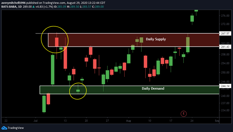
Pictured here is BABA(Alibaba) Daily chart. Noted in red is the daily Supply Zone and noted in green is the Daily Demand Zone. On top of the move to 267 on the daily, a red (bearish) Doji candle was made on July 9th, noted by the yellow circle. This is now the new Supply Zone that the price will have to break for higher continuation. On July 16th, the price movement made a second test of the 240 Daily demand zone and filled the gap made on July 8th while also creating a green (bullish) Doji candle, hinting that BABA is finding support here as the price is in agreement.
*** This next rule is very important to find the most explosive move coming next based on Supply and Demand Zones ***
Supply/Demand Zones love to follow the saying, “Third time the charm.” What I mean by this is that you will likely see price movement test these zones not once… not twice… but likely three times before finally breaking through. The 1st attempt to break one of these zones will likely see a strong rejection or bounce off that said zone due to the largest amount of buyers or sellers waiting for the price to meet that region. Eventually, the number of buyers or sellers will dwindle down to the point to where the opposition will force the price through this level by simply outnumbering the other.
Now let’s say you’re watching Alibaba. Alibaba is currently in a demand zone finding support. After a period of consolidation, Alibaba finally breaks out of the demand zone for the first time. There is a high probability Alibaba will retest this demand zone to confirm the support below and, more importantly, allow more buyers to step in at the best price possible to support a higher price movement.
In the opposite scenario, let’s say Alibaba is attempting to test recent highs. Likely there is a strong supply zone at these highs, and IF this is the first test of these highs. You will likely see a STRONG rejection of this region due to the massive amount of people trying to lock in profits.
After each test of the Supply/Demand zones. The zones will progressively become weaker and weaker. a zone that is untested is known as a “fresh” zone. Fresh zones provide the most strength behind them for the next incoming move. The reason being is that these fresh zones haven’t seen a test of it before, so most sellers or buyers will be getting out of their position or entering their position there at that price point.
When a Demand Zone is tapped into for the first time. There is a high probability you will see a strong bounce out of this zone. It may not happen immediately due to the time frame in which this zone was created, but you can rest assured a bounce will happen quickly after it is tapped into. Fresh demand zones are the best areas to buy confidently as this will act as a strong support with new buyers waiting to get in their position while shorts will be exiting their position or get squeezed out of their position by the bounce.
After a Demand Zone has been tapped into once in a bearish scenario, this zone will gradually become weaker. This is where it’s better to watch price action as it attempts to breach through the top support of this zone. Once this happens, it is crucial to see how the price reacts to the bottom support of this zone. Again since this zone has been tapped into once already, the chance of this zone holding up becomes less and less likely.
As mentioned earlier, it usually takes multiple tests to break these zones, especially if they are fresh. This is so that the demand can gradually begin to outweigh the supply to support the price to move higher or so the supply can begin to outweigh the demand that is protecting the price from moving lower.
Example
Here is a scenario of Supply and Demand Zones being implemented on a chart. This is BABA(Alibaba) Daily chart. After the high was made on July 9th, the new daily supply zone was created. (Noted in red) When charting the supply zone, you take the wick high and the close of the candle. I repeat, the close, not the low of the candle. (Unless it’s bearish engulfing; completely red) That is now your Supply zone until it’s broken. From here, you will need to find the daily demand zone to calculate your appropriate support for a bounce off the correction. In this case, the gap-fill acted as our demand zone, which is common in most gap-fill cases.
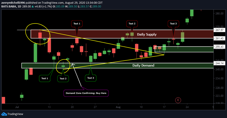
Now, after the supply zone is created and you have found your demand zone. This is where you have to be patient with the price imbalance to reach this area of demand. (Noted in green) Once the price reaches this area, you place your buy order with confidence knowing this is the strongest area of support. Most importantly, you need to trust your demand zones, knowing you will see a bounce out of this level. (Note when finding supply/demand zones the higher the time frame, the stronger the zone) As mentioned earlier in this section, each zone tends to be tested at least three times before breaking either way. So as noted in the image above, BABA actually makes two tests of the demand zone before testing the recent high, where we saw a strong rejection upon entering this fresh supply zone.
Since we have seen 2 tests of the demand zone already and keeping the rule of 3 touches in mind. We know that we now have one more bounce incoming off the same zone before creating a confident bullish scenario. Upon test 3 of the demand zone with a hold of the demand support, we see that this zone has proven the strength and quality behind it. From here, we see test 2 of the supply zone, where you can see we actually break into the zone instead of rejecting immediately. Every time a zone is touched, it progressively becomes weaker and weaker, as seen in the chart above. This was also mentioned earlier in this section. Since this is test number 2 of the supply zone, we know a breakout is unlikely but possible. This is where waiting for confirmation of the demand, as mentioned before, is crucial. In this case, a bull flag begins to confirm, and a higher low is created upon attempting to reach the demand zone. This is your first 100% confident buy zone as the price for demand continues to move higher from here.
As you see in the chart, we begin to break out of the bull flag after we touch the base of the trend line support for the third time. Then on the third touch of the supply zone, we reject again, but the key here is watching for a higher low to be made off the new demand zone that was created. (As noted by the green box on August 14th) After a successful test of the new demand zone, we see an engulfing bullish candle confirming a strong price movement on the daily with volume through the supply zone, unlike the last 3 attempts followed by a strong gap up the next day after confirming the breakout of the supply zone.
Another way to trade these zones is to simply buy when it hits daily demand and sell when it hits daily supply. Volume and, of course, it is a strong company that can make the difference on whether it can take a single trading day or several trading days to complete a maximum R:R trade based on the supply and demand zones.
*** Another Important rule to note is when a supply zone is turning into a demand zone or vice versa***
Once a Supply Zone has been gaped over, you will need to watch how price action reacts to this area. What you want to see is the bottom of the supply zone begins to act as support or, even better, the top of the supply zone. As this is happening, buyers’ confidence will begin to strengthen because the previous resistance is clearly no longer a wall that needs to be broken through. As the price continues to confirm its new support, your next move is to watch the top of the zone begin to be tested and eventually be broken to the upside. Once the top of the zone is broken, the price will begin to move higher in an aggressive manner confirming the breakout.
Depending on your risk tolerance, you will want to take your position on the breakout after the zone confirms as support or in the consolidation period within the zone, but if you do take the second route, do note that a breakdown can still occur as the price still needs to hold or clear the top resistance of the supply zone.
Example
The chart here is the FB(Facebook) Daily chart. On July 21st FB attempted to break the recent high it made days before, where it rejected down from 247.22, successfully creating a new supply zone. After finding a bottom near the 225 level, FB had a PEG (Power Earnings Gap) above the recent supply zone created.
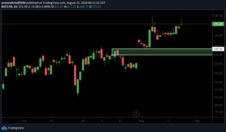
Then a falling wedge was created for a few days after breaking ATH down to the top of the old supply, now demand zone, where it then had a bullish engulfing candle the next day after. Take the time to find moves like this. Instead of playing the ER, play the move coming to the next trading session after. Catching these moves is absolutely game-changing and can bring back large returns rather quickly, more often times than not.